Composition
 | 1. Placing your main subject and horizons in the center of your photograph is not always recommended. At the same time your subject shouldn’t be on the edges. |
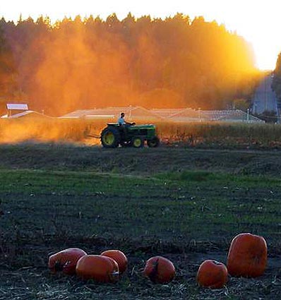 | Although this rural scene have some compositional similarities to the photograph above ( entry via the pumpkins in the foreground). The overall sense is one of tranquility. This has been achieved by placing the main subject, in this case the tractor and the path it is traveling along down the middle of the photograph. The placement of the horizon is an important tool in visual composition. We ignore it at our own peril. |
 | 2. Divide your screen into thirds and place
your main subject on one of the intersecting points. This point should also have
the greatest contrast.
|
 | Here we have an example of lake meets sky. By placing the horizontal line on the bottom thirds line the sky dominates. Had the camera been tilted down and the horizon line placed on the top third line, the lake would dominate the scene. Notice how the vertical thirds line is placed on the distant mountains, another point of interest in the photograph. |
 | 3. Keep it simple. Don’t overload your images with too much information. Divide your photograph into unequal portions. |
 |  |
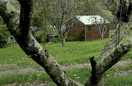 | 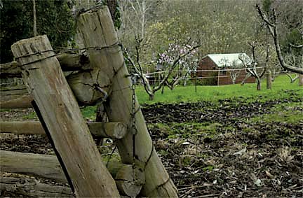 |
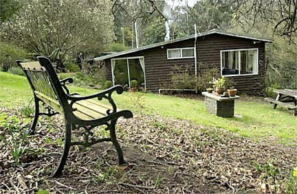 | Note how the park bench in the foreground helps to create a feel of depth. The bench and house are placed on opposite intersections, as are the cabin and fence in the photograph above. There is a great visual attraction between these opposing points! |
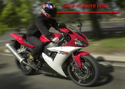 | 6. Give people on the move (running, riding) space to "move" into. |
As above we have the panning effect to suggest motion, again by placing the rider in the
back third of our frame, we give the rider two third of the frame to "move"
into. As we are not always able to do this in the camera, we do so with our editing software. Have you noticed how these last two examples (bike & go-cart riders) have been placed on opposite sides of the web page? Why do you think this was done?
|  |
 | In this image we can see what happens when we don't think about subject placement. How different is this photograph from the other examples? What about placement on the page itself? |
 | 7. Winding roads, paths and rivers
should not run out of your frame. Use one of the intersecting thirds as a
point of exit. |
 |  |
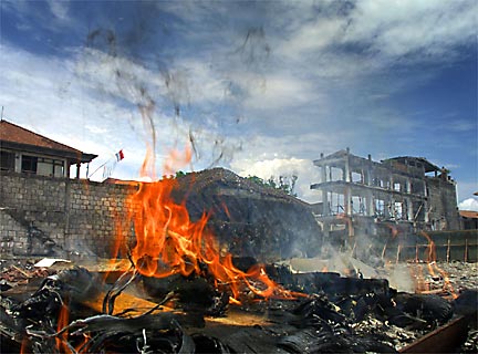 Terror in Bali. |
This image of the aftermath of the bombing in the nightclub district in Bali is constructed so as to convey maximum impact of the horror. The flames in the foreground and their proximity to the camera grabs our attention immediately. When photographed using a wide angle lens and getting physically close, we are able to make the viewer feel as if they themselves are there on the spot. Photograph the same scene from a distance using a long lens, and the inherent nature of these lens will create a certain amount of visual detachment. This is why photojournalist when it is safe to do so, prefer to work up close to the action. Note the balance between the flames and the bombed out building diagonally across from it. |
 | The following slide show demonstrate the importance of balancing foreground and background subjects within the frame. In some instances the foreground can act as a doorway into the main picture area. By strategically placing our picture elements within the frame, we are able to take the viewer on a journey from one point of interest to the next. |
Depth of field, motion, lenses lenght and composition, so do we now finally take the photograph? The answer is no! And why, because now we need to look at the final step Lighting.
